SHED THEORY
IDENTITY & BRAND DEVELOPMENT

For the past four years, I’ve been building Shed Theory alongside a group of close friends and collaborators. What started as a small collective of experimental musicians has grown into a full-fledged creative ecosystem—rooted in the forests of the Hudson Valley but reaching listeners and fans far beyond.
My role has centered around shaping how Shed Theory looks and feels. I’ve developed the group’s visual identity by blending graffiti textures, natural elements, and quiet surrealism—pulling from the landscapes we grew up in and the alternative culture we’ve always been drawn to. From album artwork to promotional graphics to merch drops, I’ve worked to make each release feel distinct but part of a shared world.
GRAPHIC DESIGN PROJECT

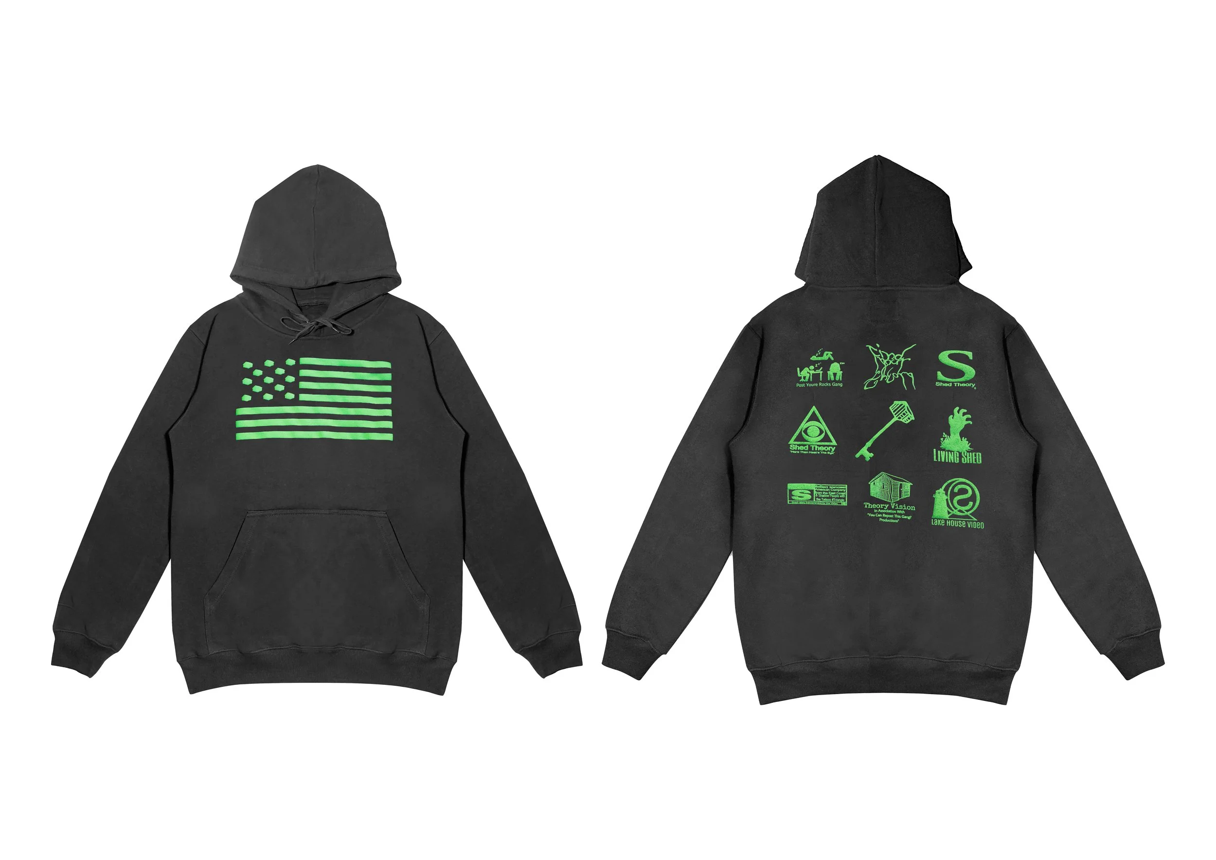
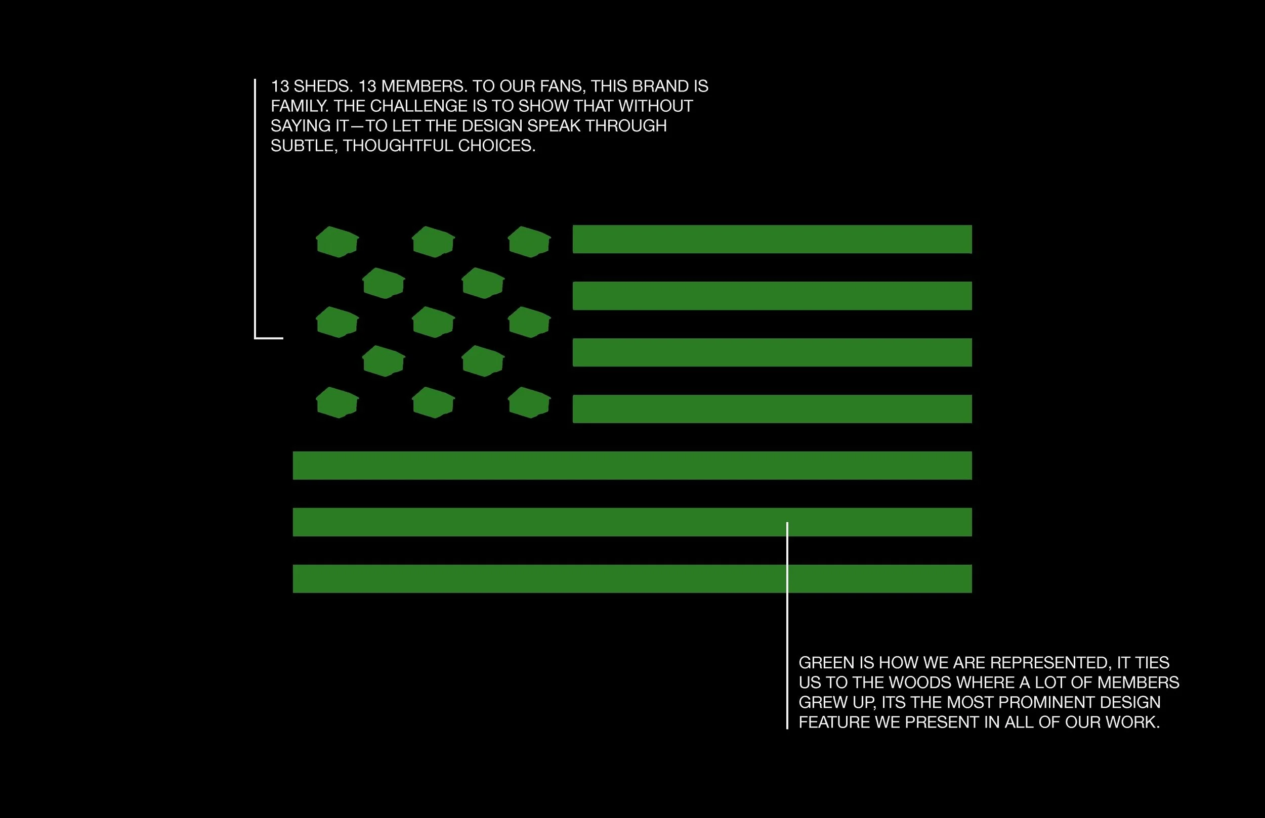
This specific project led to one of our most recognized designs: a reinterpretation of the American flag, transformed into an emblem of independence, collaboration, and youth. The back reflects a sense of New Americana—cinematic and social, rooted in the fabric of everyday life. THESE BECAME SYMBOLS of the world wE ARE SURROUNDED By, reimagined for a new era BUT something tangible for an ever-growing fanbase. WE REPLACED THE STARS WITH OUR BRAND LOGO. EACH ONE REPRESENTS A DIFFERENT MEMBER, 13 MEMBERS, 13 SHEDS.